Best Practices
Content
Quantity of content
- Have a goldilocks amount of information. A wall of text can be daunting to try to find information in and a page with only minimal information may be suited to go onto another page all together to keep the number of links down. Bullet points and headers are a great way to break up space and help a user skim through a page.
- Use concise, non-redundant content. To keep information streamlined, just put it in one spot (and then link to it in other spaces) instead of multiple spots on your site. This limits the amount of links and should help users find what they’re looking for easier. Doing this will also help information stay up to date by only having one place to update it if the information needs to change.
Quality of content
- Information should be relevant and useful to your audience. Who is your audience? If it is the family of students, they probably don't need to know bus routes and pick up times. Keep the information relevant.
- Information should be up to date. Schedule a time each semester (or other time frame that works best for your work) to look over information on your site to make sure nothing has changed since it was last updated. Make sure the user is getting accurate information.
- Check for misspellings, grammar errors, jargon. Avoid using abbreviations or academic jargon without defining it for the user.
- Content should comply with the university editor’s manual.
- All users should have similar experiences when they visit our site. See the accessibility page for information that will help you accomplish this.
Content organization
- Content should be easy to get to. How many clicks does it take the user to get to this information? Limit the number of steps it takes for a user to get to your information.
- Content should reflect the page title. The content should be what the user expects to find when they go to your page.
- Content should be appropriate for the public-facing site. Is this for internal use only? Would it be better stored on Teams, Sharepoint, Blackboard, etc.?
File Management
Organization
- Use folders to organize photos, documents in media folder rather than just having them in the root folder.
- Name files / folders appropriately and uniquely.
File Use
- Save space / download time for user
- Appropriate file size — If over 1mb for an image, probably too big
- Optimize files with a site like squoosh.app
- Files (such as a PDF) should be saved for screen unless user needs to print them
- Do not upload video/audio to our site. Link or embed YouTube, Vimeo and Soundcloud.
- If you’re using the same file multiple times, only upload it once but then use it in all the different places you need it. When you need to update it, you'll then only have to update it in one place.
- Instead of making the user download a PDF or word document, make it a webpage or web form instead.
- Accessible PDF is the next best option. Have the user download a word document only as a last resort.
- Get rid of anything that isn’t being used anymore.
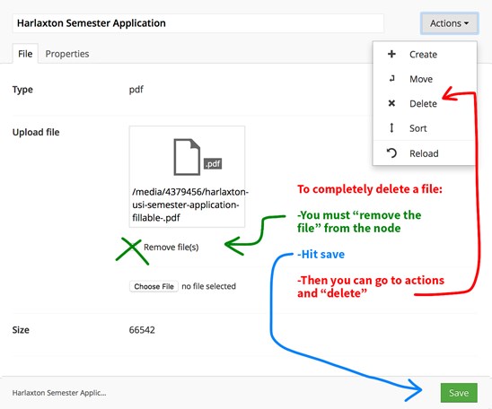
- Directions to delete something completely in Umbraco: To delete a file completely, you must delete it and then delete its node. Start by finding the node of the file in the media library. In this screen, you'll see a thumbnail version of the file or an icon that represents it. Under that, check "Remove files" and then hit "Save" at the bottom of the screen. Now the file is gone but you still need to delete the node. To delete the node, you'll go to the top left "Actions" dropdown and select "delete." Now your file is gone from the site and will not be found by google any more.

Web Services