The Tableau Device Preview Guide allows you to make a dashboard viewable on a mobile device. If you do not make your dashboard mobile-viewable, users may have to pinch in and out to see your visualizations more clearly, and some features may not be visible at all. For this reason, if you anticipate any of your users needing to access your dashboard on mobile devices, you should use the Devise Preview Guide.
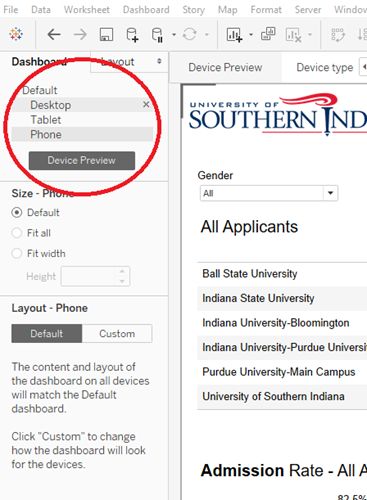
- Once you have the basics in place for your dashboard, click on the Device Preview button underneath the Dashboard tab on the left.
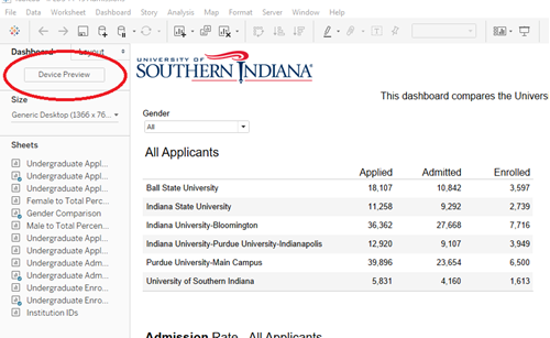
- Once clicked the Device Preview toolbar will be displayed above your dashboard area.
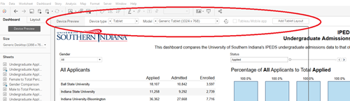
- There are four general Device Types
- Desktop
- Tablet
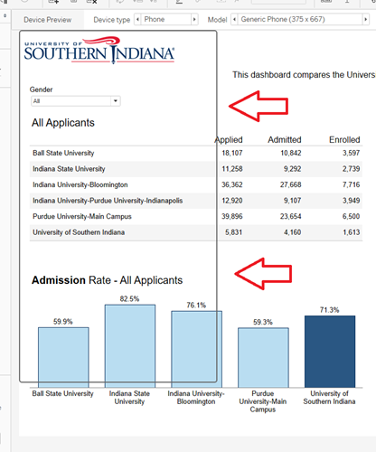
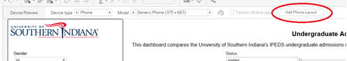
- Phone
- Default
- Within three device types, there are multiple Models. For simplicity sake, it is best to stick with the generic models of each device type.
- Generic Desktop Monitor (1920 x 1080)
- Generic Table (1024 x 768)
- Generic Phone (375 x 667)
- As you scroll through the various device types, you’ll see a dark gray outline change. This is the frame of the model and helps you visualize the space available in each model.
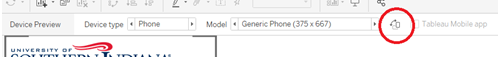
- Before moving anything around, add each device type/model you wish to make, by clicking the Add Layout
- Add Desktop Layout
- Add Tablet Layout
- Add Phone Layout
- Each device type model will be display underneath Default on the Dashboard tab. You can click on each device type to move between them quickly.
- You can now begin to arrange your dashboard visualizations within each device type model. Within each type, you can also switch between portrait and landscape model. For the tablet and phone layouts, it is best to first design in portrait mode.
- Arranging your layouts for tablet and phone can be a little tedious. Here are some best practices to assist:
- Simplicity is key. Due to screen size limitations, the number of visualizations should be limited. You may need to prioritize the charts and graphs from the original dashboard. Think about what your user will have to see on a mobile device and what can be viewed later on his/her desktop.
- Limit your filters and give your user plenty of space to use them.
- You may need to make important text and data bigger and bolder.
- You won’t have hover capabilities in mobile devices, so don’t count on tooltips. If you have additional information in a tooltip that would be important to the user, consider incorporating it another way.
- When you are done arranging your layouts, Tableau will automatically publish all of the different layouts at the same time.
Download Device Preview PDF